 |
Cheat Engine
The Official Site of Cheat Engine
|
| View previous topic :: View next topic |
| Changes are: |
| Good |
|
66% |
[ 8 ] |
| Allright |
|
33% |
[ 4 ] |
| Bad |
|
0% |
[ 0 ] |
| Unsure |
|
0% |
[ 0 ] |
|
| Total Votes : 12 |
|
| Author |
Message |
karmah
Newbie cheater
![]() Reputation: 0 Reputation: 0
Joined: 28 Jul 2009
Posts: 19
Location: Edinburgh UK
|
 Posted: Wed Jul 29, 2009 6:36 am Post subject: [release] Cheat Engine DVX - w/ new features inc' stack view Posted: Wed Jul 29, 2009 6:36 am Post subject: [release] Cheat Engine DVX - w/ new features inc' stack view |
 |
|
Hey guys!
I've put together an unofficial release of cheat engine - dubbed DVX.
There's tons and tons of feature's we've needed for a while,
and a much cleaner, easier-on-the-eyes main window.
The code could be considered proof of concept, so don't expect
extreme stability, but it feels a lot more like working in olly.
Feature list:
Disassembler:
Ability to resolve dynamic operands such as [ecx+4], [ebx*2],
and check for ascii/unicode strings, and show the results in the comments.
On a jump, the destination is highlighted, and all jumps to
the selected line are highlit purple. (perhaps not, i'm colorblind. hoot)
The ability to follow operands such as ecx+4, [ecx+4], [04040453] in
the dump and disassembler, including viewing current line in the
memory view.
Retn/Nops - auto colored gray, modded nops are blue.
Any modifications made are auto-entered into the code list, and
highlit, with a restore/delete opportunity.
Every change, click, or movement is recorded, and can be rewinded
with ctrl -
Current line is now centred, as opposed to being the top line.
Few new menu options, to speed things up.
-plans to have the comment field show whether or not the next
jump is taken or not.
Stack Trace :
Full stack display, from ESP to first frame, to the last.
Options to view address/[address], in dump, add to address
list, modify the stack, and view parts in disassembler.
Also shows any relative unicode & ascii strings.
This panel appears permanently below the registers window and
auto updates.
Memory View:
Updated highlighting , displays offset of selected bytes,
and the ability to follow relevant dwords in memory.
There is also a 'go back' function now.
Registers:
Rearranged for pure awesomness
The FPU registers, etc have been moved into the
same pane to bring the window count down.
-Plans to auto-show MMX registers.
Assembler/Popup
Now a more linear process. (less popups for automatic actions)
Windows are auto-placed for dualscreen systems to avoid hidden,
or undrawn window scenarios.
A 'test' function for the assembler: returns valid/invalid, without
commiting to change the code.
Code list:
The old 'advanced options window', other features have been
moved to various places.
Open Process:
Now multiline, with improved icon sizes, and button positioning.
Thread break:
Added a 0 default.. saves a click;
Other:
Fixed a little bug windowblinds was causing, drawing various
canvases.
Main view
A ton of changes.. Trust me, it just looks .. cleaner.
A new toolbar, simpler menus..
Search specific items now show only when needed required.
There's a fancy little log in the disassembly results, etc
detach debugger menu.
Sure there's more.. can't remember.
I dunno how common these mods are or if it's even original
work,but it feels like a step forward. Keep me up to date
with bugs and stuff, and I'll try and stay on top of 'em.
Oh and of course, cheers to darkbyte. Dude, must've taken
insane patience to code some of those damn tables.
Take care,
enjoy it guys!
download - for ce5.5 , executable only for now:
Sorry , but no permission to post links, so the onus
is on you to figure this out, and check for any possible
harm it could cause.. etc etc..
www@wopstick@co@uk/dl/cheatengine_dvx_01@rar
Source:
Available if anyone wants it.. huge upload, but I'll get around to it.
Darkbyte:
Every modification down to variable and function declarations has been marked with a //mod comment, and optionally a small description, to aid with easy intergration into the main source.
Most of the changes are additions not, modifications, but again, all marked clearly.
|
|
| Back to top |
|
 |
DanielG
Expert Cheater
 Reputation: 1 Reputation: 1
Joined: 13 May 2009
Posts: 130
Location: The Netherlands
|
| Posted: Wed Jul 29, 2009 7:28 am Post subject: |
|
|
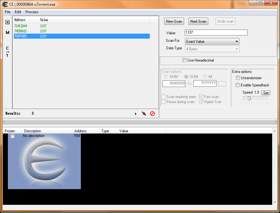
The font used is quite narrow in the found adresses box and disassembler, I prefer the good readable old font (maybe you used a font not normally installed on the pc?).
The buttons on the left (right under "File") are messed up (the 'N' button is hardly visible or clickable).
The area below is black around the picture so I can't see the text.
I've added a screenshot.
| Description: |
|
| Filesize: |
99.24 KB |
| Viewed: |
22284 Time(s) |
|
Last edited by DanielG on Wed Jul 29, 2009 7:35 am; edited 1 time in total |
|
| Back to top |
|
|
Dark Byte
Site Admin
 Reputation: 471 Reputation: 471
Joined: 09 May 2003
Posts: 25833
Location: The netherlands
|
| Posted: Wed Jul 29, 2009 7:35 am Post subject: |
|
|
Most of the changes are good
The gui could use some alignment fixes
The memoryview/disassembler is nice (although it has a slight scroll bug with grey color)
And yes, send me the source (to [email protected]) I'll see which parts can be integerated into the main project (and yes, you'll be in the about screen)
Not sure about the main menu gui though, menu system is ok, but the small buttons just feel weird
_________________
Do not ask me about online cheats. I don't know any and wont help finding them.
Like my help? Join me on Patreon so i can keep helping |
|
| Back to top |
|
|
Anden100
Grandmaster Cheater
![]() Reputation: 0 Reputation: 0
Joined: 20 Apr 2007
Posts: 668
|
| Posted: Wed Jul 29, 2009 9:16 am Post subject: |
|
|
Stack Trace... I love it!, how come it hasn't been in there untill now!?
All in all the Memory Viewer looks alot better!, though you should make the black bars gray as the rest of the window
The new Process List window is very neat aswell, though i think you should narrow it down to 2 rows per page, instead of 3, and the buttons at the bottom could need some re-alignment
Another font?
What the hell happened to the code list?, i looks like the one in DanielG's post!
But i really would prefer the normal Cheat Engine Main Gui
Its a very nice work you've done, and i really believe some of these addons will be a great addition to Cheat Engine, keep up the awesome work!
|
|
| Back to top |
|
|
karmah
Newbie cheater
![]() Reputation: 0 Reputation: 0
Joined: 28 Jul 2009
Posts: 19
Location: Edinburgh UK
|
| Posted: Wed Jul 29, 2009 9:34 am Post subject: |
|
|
Hah, woops, sorry about the alignment guys..
Seems there's a multitud of differences when rendered on
a vista machine...
I.e. DB manually resized and relocated a lot of the gui
objects, and anchored them, and I keep forgetting to
remove the anchoring. Lol.
Again, the font, and the address list window, seem to
be vista issues.. Terminal 9pt on Xp is nice, square
and chunky.. I'll use the good old fashioned CE font 
Same issues with the scrollbar color I believe, and
I think you're right Anden, about it being 2 wide
instead of 3.
The grey scrolling in the disassembler.. yeah I guess
that's a programatic error, but a minor temporary
bug...
But yeah, proof of concept, cheers for the feedback..
I'll get to it
DB:
Use it for an hour or two.. you'll get used to the small
buttons.. but of course, it's your work, lol.
Initially I wanted to port the external tools section into
that small toolbar, with a toolbar/coolbar component..
but wasn't sure how inter-compatible that component is with
the various delphi releases.
If you'd allow my account to post links DB, then I'll post
a screenie of how it's supposed to look
hint:
http://s654.photobucket.com/albums/uu265/wopstickle/?action=view¤t=CEDVXscreenie.jpg
Anyway, I'll chuck a copy of vista on a spare laptop and
fix the rendering in a bit, then upload the source
Ty for the feedback
Oh, and what do people think of the scan part?
I.e. the way only relevant details are shown?
(hex/dec , unicode/asci, etc etc)
_________________
//todo : sig :\ |
|
| Back to top |
|
|
Anden100
Grandmaster Cheater
![]() Reputation: 0 Reputation: 0
Joined: 20 Apr 2007
Posts: 668
|
| Posted: Wed Jul 29, 2009 10:51 am Post subject: |
|
|
I've been messing around a bit more, and it seems pretty nice
I really like much of the scan alignment, though, i think you should switch the positions of the checkboxes (scan readonly mem., fast scan, etc) and the Scan Options, and i still prefer the Progress bar being above the rest of the gui, or possibly in the status bar at the bottom?, being in the background behind the text. Aswell i think the Use Hexidecimal is placed wrong (Multibyte and Unicode is place nice though), i think the Use Hexidecmal should be as close the the input line as possible
And, a minor patch, chage the Window Name to Cheat Engine instead of CE, when you got the space, take advantage of it!
I am aswell missing the Process List, Open and Save buttons!
And, the black lines at the Memory View, i think you, aswell as making them gray, make them 1 pixel slimmer
Most of this is small patches, but they will increase the overall look, i believe this project has a very big potential, but there is still alot to do 
And, the image:

|
|
| Back to top |
|
|
Dark Byte
Site Admin
Reputation: 471
Joined: 09 May 2003
Posts: 25833
Location: The netherlands
|
| Posted: Wed Jul 29, 2009 1:01 pm Post subject: |
|
|
stacktrace has been in ce for a long time, (and you could run it at the same time as debugging) but yeah, it wasn't very extensive (normal ce->view->stacktrace while stepping through code)
| Quote: |
Initially I wanted to port the external tools section into
that small toolbar, with a toolbar/coolbar component..
but wasn't sure how inter-compatible that component is with
the various delphi releases.
|
One of the things for the ce project is to not use extra design time packages. As it'll confuse a lot of people that just want to make small changes.
But, you can make use of extra visual components, if you can get them to work by including the sourcecode with CE and create them at runtime. Example of this is the SynEdit component
| karmah wrote: | Oh, and what do people think of the scan part?
I.e. the way only relevant details are shown?
(hex/dec , unicode/asci, etc etc) |
Didn't notice it, but yeah, it does look nice (again some alignment stuff but that's just one of the things that's hard to do, especially on systems that mess with the dpi)
_________________
Do not ask me about online cheats. I don't know any and wont help finding them.
Like my help? Join me on Patreon so i can keep helping |
|
| Back to top |
|
|
karmah
Newbie cheater
![]() Reputation: 0 Reputation: 0
Joined: 28 Jul 2009
Posts: 19
Location: Edinburgh UK
|
|
| Back to top |
|
|
Anden100
Grandmaster Cheater
![]() Reputation: 0 Reputation: 0
Joined: 20 Apr 2007
Posts: 668
|
| Posted: Fri Jul 31, 2009 3:52 am Post subject: |
|
|
| Dark Byte wrote: | stacktrace has been in ce for a long time, (and you could run it at the same time as debugging) but yeah, it wasn't very extensive (normal ce->view->stacktrace while stepping through code)
... |
I know about the stacktrace, i've been using it alot, but i think this is better, since all the space isn't in any way needed for the Hex View
|
|
| Back to top |
|
|
karmah
Newbie cheater
![]() Reputation: 0 Reputation: 0
Joined: 28 Jul 2009
Posts: 19
Location: Edinburgh UK
|
| Posted: Fri Jul 31, 2009 1:43 pm Post subject: |
|
|
Well, I had a fiddle and I think I've addressed
most of the issues
The tooolbar's have been moved slightly, progress
bar, fonts, etc etc
I've included the source this time...
all modifications are marked //mod
either for whole functions or
All modifications from CE 5.5 offical are marked
//mod
either for complete functions or code chunks.
The new code isn't very ...refined.. but like I
say, proof of concept. It is however very clear,
and easily readable , so the style clash shouldn't
be an issue
I keep meaning to add an option to keep the mem brower
permanently aligned to 16 bytes, and 4th button
next to resize,maximise,close, etc to pin individual
windows on top.. in theory (besides a shared unit),
it should only take about one extra line per form
Anyhoo do with it as you will, hope intergration's
not a biggy, darkbyte.. I really like some of the
new options, heh.
Enjoy
Oh, and if someone could post a screenie again?
That'd be great cheers!
SRC ( ~ Delphi 7 )
h@@p://www@wopstick@co@uk/dl/CE_DVX_2_SRC.RAR
BIN ( cheatengine.exe )
h@@p://www@wopstick@co@uk/dl/CE_DVX_2_BIN.RAR
_________________
//todo : sig :\ |
|
| Back to top |
|
|
Anden100
Grandmaster Cheater
![]() Reputation: 0 Reputation: 0
Joined: 20 Apr 2007
Posts: 668
|
| Posted: Fri Jul 31, 2009 4:26 pm Post subject: |
|
|
Just a few first-launch oppinions
Rezise the Main Window and the Memory View, so it doesent need to be done by the user at startup, its very messy sized
The toolbar above the Scan Results should be split in two lines, or the last half should simply be removed, its too wide
Again, as pointed out earlier "Use Hexidecimal" should be placed as close to the edit line as possible, as in Original CE
When you double click an operation in the Memory View to edit it, and then press "Cancel", the line turns white...
(and BTW, please stop creating new lines in your posts all the time...,
| Code: | I keep meaning to add an option to keep the mem brower
permanently aligned to 16 bytes, and 4th button
next to resize,maximise,close, etc to pin individual
windows on top.. in theory (besides a shared unit),
it should only take about one extra line per form |
should be:
| Code: | | I keep meaning to add an option to keep the mem brower permanently aligned to 16 bytes, and 4th button next to resize,maximise,close, etc to pin individual windows on top.. in theory (besides a shared unit), it should only take about one extra line per form |
|
|
| Back to top |
|
|
Dark Byte
Site Admin
Reputation: 471
Joined: 09 May 2003
Posts: 25833
Location: The netherlands
|
| Posted: Fri Jul 31, 2009 7:10 pm Post subject: |
|
|
Thanks, I'll check it out.
I can't promise I take much of the gui over (a few things I will like the scan settings) but I will probably take much of the memory browser
(openglmess menu option isn't implemented)
_________________
Do not ask me about online cheats. I don't know any and wont help finding them.
Like my help? Join me on Patreon so i can keep helping |
|
| Back to top |
|
|
karmah
Newbie cheater
![]() Reputation: 0 Reputation: 0
Joined: 28 Jul 2009
Posts: 19
Location: Edinburgh UK
|
| Posted: Sun Aug 02, 2009 5:42 am Post subject: |
|
|
Anden:
Delphi's StrtoInt function auto reads
strings prefixed with a $ as a hex string.
I dunno if that was documented, but it
(mostly) negates the need for the little
box being so accessable.
Besides, having the hex box up there, would
make the input box's alignment a little
silly for certain other things.
As for the messy layout, I'm thinking
it could be DPI settings again...
This is how it should look,
h@@p://i654@photobucket@com/albums/uu265/wopstickle/screenie2-1@jpg
The double-click cancel turning lines white was
left basically because you could use the line as =
an improvised bookjoe. I guess a little checkbox
determining this behaviour could be handy
And finally, regarding the width of my
paragraphs, heh, my screens are each
about 2 feet wide, so it can be a pain in
the ass resizing the browser to wrap lines
the length of my arm, haha.
Anyhoo, the gui, as I've said is mostly
just a suggestion or proof of concept,
since ultimately, it's DB's release
DB:
No worries, it'll just be cool to have
some highlighting and a stack trace, etc
The openGLMess was just a suggestion for
relocation.
Take care!
Karmah.
_________________
//todo : sig :\ |
|
| Back to top |
|
|
Anden100
Grandmaster Cheater
![]() Reputation: 0 Reputation: 0
Joined: 20 Apr 2007
Posts: 668
|
| Posted: Sun Aug 02, 2009 7:48 am Post subject: |
|
|
| I still think the main gui is waaay to wide, look at the space for the values, i dont think you will ever get that filled...
|
|
| Back to top |
|
|
karmah
Newbie cheater
![]() Reputation: 0 Reputation: 0
Joined: 28 Jul 2009
Posts: 19
Location: Edinburgh UK
|
|
| Back to top |
|
|
|
|
You cannot post new topics in this forum
You cannot reply to topics in this forum
You cannot edit your posts in this forum
You cannot delete your posts in this forum
You cannot vote in polls in this forum
You cannot attach files in this forum
You can download files in this forum
|
|

