| View previous topic :: View next topic |
| Author |
Message |
Adolfo
I'm a spammer
 Reputation: 0 Reputation: 0
Joined: 26 Aug 2007
Posts: 5184
|
 Posted: Sat Sep 19, 2009 9:23 am Post subject: [=D]Approaching. (Updated)(Again) Posted: Sat Sep 19, 2009 9:23 am Post subject: [=D]Approaching. (Updated)(Again) |
 |
|
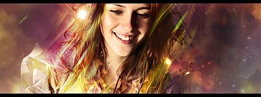
First try at using a sprite and many C4D's xD

C&C please.
Ver2:

Is it better or worse?
New ones:
Ver 3:

Ver 4:

_________________
Last edited by Adolfo on Sat Sep 19, 2009 12:59 pm; edited 3 times in total |
|
| Back to top |
|
 |
Daniel.
I post too much
![]() Reputation: 72 Reputation: 72
Joined: 08 Nov 2007
Posts: 2938
|
| Posted: Sat Sep 19, 2009 9:31 am Post subject: |
|
|
is that a sprite?
_________________
|
|
| Back to top |
|
|
~Lucifer~
Expert Cheater
![]() Reputation: 0 Reputation: 0
Joined: 04 Feb 2008
Posts: 138
Location: Canada
|
| Posted: Sat Sep 19, 2009 9:47 am Post subject: |
|
|
all the black on the left side is wasted space. get rid of it or use it for something.
_________________
|
|
| Back to top |
|
|
Adolfo
I'm a spammer
Reputation: 0
Joined: 26 Aug 2007
Posts: 5184
|
| Posted: Sat Sep 19, 2009 9:51 am Post subject: |
|
|
What could I add?
_________________
|
|
| Back to top |
|
|
Daniel.
I post too much
![]() Reputation: 72 Reputation: 72
Joined: 08 Nov 2007
Posts: 2938
|
| Posted: Sat Sep 19, 2009 9:59 am Post subject: |
|
|
| Adolfo wrote: | | What could I add? |
a lil more effect on the left :3
_________________
|
|
| Back to top |
|
|
Kronos
Grandmaster Cheater Supreme
 Reputation: 0 Reputation: 0
Joined: 15 Dec 2008
Posts: 1606
Location: wtf
|
| Posted: Sat Sep 19, 2009 10:11 am Post subject: |
|
|
well im sure using an sprite is a very difficult thing, i think it needs flow some of the effects are killing the flow right now and the left side is too empty+ text is distracting
_________________
|
|
| Back to top |
|
|
ResidentGenocide
Advanced Cheater
 Reputation: 0 Reputation: 0
Joined: 16 Sep 2009
Posts: 56
Location: Currently In Germany
|
| Posted: Sat Sep 19, 2009 10:38 am Post subject: |
|
|
| Besides the left side, the sig overall is good.
|
|
| Back to top |
|
|
Adolfo
I'm a spammer
Reputation: 0
Joined: 26 Aug 2007
Posts: 5184
|
| Posted: Sat Sep 19, 2009 11:19 am Post subject: |
|
|
Maybe some blurred galaxy themed thing?
_________________
|
|
| Back to top |
|
|
ResidentGenocide
Advanced Cheater
Reputation: 0
Joined: 16 Sep 2009
Posts: 56
Location: Currently In Germany
|
| Posted: Sat Sep 19, 2009 11:32 am Post subject: |
|
|
| Adolfo wrote: | | Maybe some blurred galaxy themed thing? |
I don't know what that is, lol, but I think you should try a bunch of different things and see what it comes out looking like.
|
|
| Back to top |
|
|
Adolfo
I'm a spammer
Reputation: 0
Joined: 26 Aug 2007
Posts: 5184
|
| Posted: Sat Sep 19, 2009 11:35 am Post subject: |
|
|
Ok Updated.
What do you think?
_________________
|
|
| Back to top |
|
|
ResidentGenocide
Advanced Cheater
Reputation: 0
Joined: 16 Sep 2009
Posts: 56
Location: Currently In Germany
|
| Posted: Sat Sep 19, 2009 11:38 am Post subject: |
|
|
| Doesn't look like you changed much, only the text position and some small splatter effect above it.
|
|
| Back to top |
|
|
Sharpies!
Master Cheater
 Reputation: 0 Reputation: 0
Joined: 13 Dec 2006
Posts: 433
Location: Somewhere, Anywhere, The World.
|
| Posted: Sat Sep 19, 2009 11:40 am Post subject: |
|
|
New one is a bit better and worse at the same time imo for different reasons. The added effects on the left do help balance it a bit. However it's kinda weird to me now because you've basically killed the flow by making the purple part go top left > bottom right and the white part and the sprite do the opposite.
I still like it though. :] The C4Ds on the right are nice and I think you incorporated the sprite well.
_________________
|
|
| Back to top |
|
|
Adolfo
I'm a spammer
Reputation: 0
Joined: 26 Aug 2007
Posts: 5184
|
| Posted: Sat Sep 19, 2009 11:50 am Post subject: |
|
|
| ResidentGenocide wrote: | | Doesn't look like you changed much, only the text position and some small splatter effect above it. |
Nah, just added a texture and some smudging xD
Ill try to do many versions and will post em xD
| Sharpies! wrote: | New one is a bit better and worse at the same time imo for different reasons. The added effects on the left do help balance it a bit. However it's kinda weird to me now because you've basically killed the flow by making the purple part go top left > bottom right and the white part and the sprite do the opposite.
I still like it though. :] The C4Ds on the right are nice and I think you incorporated the sprite well. |
True that. That is because the purple lines were an accident, a nice accident I mean xD Its a C4D and when I was changing the blendig modes it got on Hue and it looked how it looks now xD
_________________
|
|
| Back to top |
|
|
Simon :v
Grandmaster Cheater
 Reputation: 38 Reputation: 38
Joined: 11 Oct 2006
Posts: 708
|
| Posted: Sat Sep 19, 2009 1:21 pm Post subject: |
|
|
| V.3 has this little bubble that seems to suck in attention. ;-;
|
|
| Back to top |
|
|
Adolfo
I'm a spammer
Reputation: 0
Joined: 26 Aug 2007
Posts: 5184
|
| Posted: Sat Sep 19, 2009 1:29 pm Post subject: |
|
|
Its a planet xD
_________________
|
|
| Back to top |
|
|
|