| View previous topic :: View next topic |
| Author |
Message |
Kronos
Grandmaster Cheater Supreme
 Reputation: 0 Reputation: 0
Joined: 15 Dec 2008
Posts: 1606
Location: wtf
|
 Posted: Thu Sep 17, 2009 10:31 am Post subject: Punk Posted: Thu Sep 17, 2009 10:31 am Post subject: Punk |
 |
|

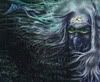
cnc. Does the text look realistic?
_________________
|
|
| Back to top |
|
 |
AIva1110
Advanced Cheater
 Reputation: 0 Reputation: 0
Joined: 16 Sep 2009
Posts: 56
Location: The Void
|
| Posted: Thu Sep 17, 2009 12:24 pm Post subject: |
|
|
Wrong angle , it should be across his chest more like 70 degrees, i think there are vectors for this. Now it looks like a stamp but everything else matches, i mean color and font seems good to me.
_________________
|
|
| Back to top |
|
|
~Lucifer~
Expert Cheater
![]() Reputation: 0 Reputation: 0
Joined: 04 Feb 2008
Posts: 138
Location: Canada
|
| Posted: Thu Sep 17, 2009 2:56 pm Post subject: |
|
|
| i like it. Its one of you better ones, IMO. AIva is right, the angle of the letters is a little off but other than that its good. 4/5
|
|
| Back to top |
|
|
Phixen
I post too much
![]() Reputation: 0 Reputation: 0
Joined: 27 Oct 2008
Posts: 4123
|
| Posted: Thu Sep 17, 2009 4:53 pm Post subject: |
|
|
| I'm not really sure if you vectored the focal or used some filter. Either way, yeah, the text is on the wrong angle. Remove the text and this might turn out well. Not one of your generic tags at least.
|
|
| Back to top |
|
|
Daniel.
I post too much
![]() Reputation: 72 Reputation: 72
Joined: 08 Nov 2007
Posts: 2938
|
| Posted: Thu Sep 17, 2009 5:00 pm Post subject: |
|
|
if the graffeti was the text that would be so sick
_________________
|
|
| Back to top |
|
|
derekkoch
How do I cheat?
![]() Reputation: 0 Reputation: 0
Joined: 17 Sep 2009
Posts: 2
|
| Posted: Thu Sep 17, 2009 6:49 pm Post subject: |
|
|
| Definetly looks like a real photo with cool affects... to reiterate yes that text looks like it's stamped on
|
|
| Back to top |
|
|
Simon :v
Grandmaster Cheater
 Reputation: 38 Reputation: 38
Joined: 11 Oct 2006
Posts: 708
|
| Posted: Thu Sep 17, 2009 7:01 pm Post subject: |
|
|
| The angle of the text is wrong, but if you angled it correctly it would fit in pretty good.
|
|
| Back to top |
|
|
redslothx
Grandmaster Cheater Supreme
 Reputation: 13 Reputation: 13
Joined: 27 Nov 2006
Posts: 1949
|
| Posted: Thu Sep 17, 2009 7:32 pm Post subject: |
|
|
or just remove the text on his shirt?
o.o
not all sigs require names on them and there's already a wall of text behind him(literally)
Also, try making it smaller by decreasing height. (might make it look cleaner and nice)
_________________
|
|
| Back to top |
|
|
The Fish
Expert Cheater
![]() Reputation: 3 Reputation: 3
Joined: 11 Aug 2008
Posts: 114
Location: Ohio bitch
|
| Posted: Thu Sep 17, 2009 7:33 pm Post subject: |
|
|
try re nagling the text on the shirt to make it look like it's part of the signature and not just slapped on at the last second
_________________
It was nice while it lasted. |
|
| Back to top |
|
|
bfsdbsdfbdsfb
Grandmaster Cheater
![]() Reputation: 54 Reputation: 54
Joined: 06 Sep 2007
Posts: 702
Location: Oh noez.
|
| Posted: Fri Sep 18, 2009 1:11 am Post subject: |
|
|
| Ozymandias wrote: | or just remove the text on his shirt?
o.o
not all sigs require names on them and there's already a wall of text behind him(literally)
Also, try making it smaller by decreasing height. (might make it look cleaner and nice) |
Imo that would be a really bad idea. I like it as it is, but try re-angling the text like Aiva said.
_________________
bsdfbdsfb |
|
| Back to top |
|
|
Kronos
Grandmaster Cheater Supreme
Reputation: 0
Joined: 15 Dec 2008
Posts: 1606
Location: wtf
|
| Posted: Fri Sep 18, 2009 6:42 am Post subject: |
|
|
Thanks for the comments.
Phixen: Yep, i used filter, 'cutout' one to be specific
_________________
|
|
| Back to top |
|
|
~Pineapple!
Grandmaster Cheater Supreme
![]() Reputation: 2 Reputation: 2
Joined: 27 Dec 2008
Posts: 1810
Location: The Local Library :3
|
| Posted: Fri Sep 18, 2009 9:47 am Post subject: |
|
|
Good use of scan lines. Love it.
The text just needs changing, and it would be awesome.
_________________
|
|
| Back to top |
|
|
|


