| View previous topic :: View next topic |
| Author |
Message |
Progression
Grandmaster Cheater Supreme
![]() Reputation: 1 Reputation: 1
Joined: 22 Mar 2007
Posts: 1541
|
 Posted: Mon May 04, 2009 3:55 pm Post subject: Very first ever signatures I've done... They suck Posted: Mon May 04, 2009 3:55 pm Post subject: Very first ever signatures I've done... They suck |
 |
|
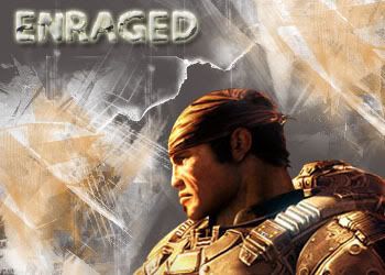
They're horrible, I know, but I was just so bored and I was so tempted to learn some Photoshop, I started out with renders and gay brushes.


_________________
|
|
| Back to top |
|
 |
Phixen
I post too much
![]() Reputation: 0 Reputation: 0
Joined: 27 Oct 2008
Posts: 4123
|
| Posted: Mon May 04, 2009 4:36 pm Post subject: |
|
|
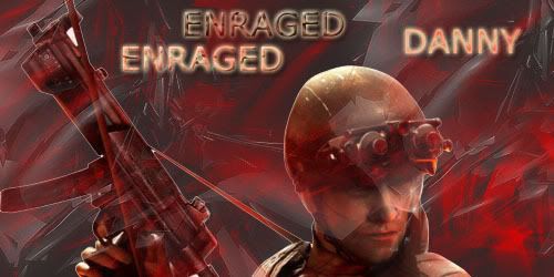
| Text doesn't really go well with the background, in short, it doesn't blend well. Don't always use brushes for making tags, add lighting. And make the render blend too. Oh yeah, why is it always ENRAGED?
|
|
| Back to top |
|
|
Progression
Grandmaster Cheater Supreme
![]() Reputation: 1 Reputation: 1
Joined: 22 Mar 2007
Posts: 1541
|
| Posted: Mon May 04, 2009 5:06 pm Post subject: |
|
|
Enraged used to be my nickname on other forums.
_________________
|
|
| Back to top |
|
|
Phixen
I post too much
![]() Reputation: 0 Reputation: 0
Joined: 27 Oct 2008
Posts: 4123
|
| Posted: Mon May 04, 2009 5:17 pm Post subject: |
|
|
| Danny wrote: | | Enraged used to be my nickname on other forums. |
Oh. Okay. There's too much redundant text, just one Enraged or Danny would've been okay. Oh and don't always use brushes, use the filter effects as well and all that other stuff. Blend the render and the text. Add a border, maybe 1-2 pixels thick. Add lighting and depth.
|
|
| Back to top |
|
|
Progression
Grandmaster Cheater Supreme
![]() Reputation: 1 Reputation: 1
Joined: 22 Mar 2007
Posts: 1541
|
| Posted: Mon May 04, 2009 5:46 pm Post subject: |
|
|
Ok. I'm going to take your opinion into consideration and make a new signature. I'll post it later.
_________________
|
|
| Back to top |
|
|
iSteam
Grandmaster Cheater
 Reputation: 0 Reputation: 0
Joined: 27 Oct 2006
Posts: 545
Location: Look up.
|
| Posted: Mon May 04, 2009 5:48 pm Post subject: |
|
|
I kinda like them, remind me of Splinter Cell games (Which I love lol.) I've never really done any photoshop work so I can't comment on the whole rendering stuff.
_________________
I didn't quit Maple, maple quit me.

Lol I play MPH |
|
| Back to top |
|
|
Saya
Master Cheater
 Reputation: 6 Reputation: 6
Joined: 11 Feb 2008
Posts: 395
|
| Posted: Mon May 04, 2009 5:49 pm Post subject: |
|
|
| Also stick to the same size when making a sig. Usually I use 400x150px. Also I find that the renders a kind of big. Also try usuing a font that fits in with the render and background. (:
|
|
| Back to top |
|
|
Phixen
I post too much
![]() Reputation: 0 Reputation: 0
Joined: 27 Oct 2008
Posts: 4123
|
|
| Back to top |
|
|
Progression
Grandmaster Cheater Supreme
![]() Reputation: 1 Reputation: 1
Joined: 22 Mar 2007
Posts: 1541
|
| Posted: Mon May 04, 2009 5:51 pm Post subject: |
|
|
| iSteam wrote: | | I kinda like them, remind me of Splinter Cell games (Which I love lol.) I've never really done any photoshop work so I can't comment on the whole rendering stuff. |
Me too, I'm a big fan of Tom Clancy games and MGS.
| Vice Versa wrote: | | Also stick to the same size when making a sig. Usually I use 400x150px. Also I find that the renders a kind of big. Also try usuing a font that fits in with the render and background. (: |
I've been trying to look for some good signature fonts, but can't find anything interesting.
Would you mind linking me to some?
Thanks for the sizes btw, I'll use 'em
Edit: @ PHIXEN, thanks!
_________________
|
|
| Back to top |
|
|
Phixen
I post too much
![]() Reputation: 0 Reputation: 0
Joined: 27 Oct 2008
Posts: 4123
|
| Posted: Mon May 04, 2009 5:55 pm Post subject: |
|
|
If you want fonts you can go to dafont. Or you can register at this site and download the font packs there, says they're good for tags.
http://www.guildinn.com/forum/local_links.php
|
|
| Back to top |
|
|
Saya
Master Cheater
Reputation: 6
Joined: 11 Feb 2008
Posts: 395
|
| Posted: Mon May 04, 2009 6:00 pm Post subject: |
|
|
Fonts
Sig Tut.
Also blurring and smudging around the render makes the render blend in more with the background. I reccomend doing that. xP It's a complex tutorial but I think it would help you make a huge improvement with all those other tut's provided.
|
|
| Back to top |
|
|
Phixen
I post too much
![]() Reputation: 0 Reputation: 0
Joined: 27 Oct 2008
Posts: 4123
|
| Posted: Mon May 04, 2009 6:07 pm Post subject: |
|
|
| Vice Versa wrote: | Fonts
Sig Tut.
Also blurring and smudging around the render makes the render blend in more with the background. I reccomend doing that. xP It's a complex tutorial but I think it would help you make a huge improvement with all those other tut's provided. |
A little too complicated for me. XD I stopped reading that since I couldn't understand most of it. o_o
|
|
| Back to top |
|
|
Progression
Grandmaster Cheater Supreme
![]() Reputation: 1 Reputation: 1
Joined: 22 Mar 2007
Posts: 1541
|
| Posted: Mon May 04, 2009 6:11 pm Post subject: |
|
|
Will do.
|
|
| Back to top |
|
|
xMurtaghx
I post too much
 Reputation: 1 Reputation: 1
Joined: 13 Apr 2008
Posts: 3611
Location: Gayville, South Dakota, 57031, United States of America
|
| Posted: Mon May 04, 2009 7:29 pm Post subject: |
|
|
The last two are plain red.
You wanna use a contrasting color on the BG then on the actual picture.
Its good for your first ones... I like the first one but I'd loose the top
"Endanger" words.
_________________

Scania- Lvl 117 DK✔

WE WILL MISS GMS!
 |
|
| Back to top |
|
|
Noodlez
<3
 Reputation: 1 Reputation: 1
Joined: 27 Oct 2007
Posts: 744
Location: Hyrule
|
| Posted: Mon May 04, 2009 10:43 pm Post subject: |
|
|
| They are all ok.... I do like the last one though
|
|
| Back to top |
|
|
|


